Image Optimization with Astro: Building a Reusable Component
Why Image Optimization Matters
Images often make up the largest portion of a webpage’s size. Without proper optimization, they can significantly slow down your site, leading to poor user experience and lower search engine rankings. By properly optimizing them, you can significantly improve your blog’s performance, load times, and user experience.
In this comprehensive guide, I’ll show you how to build and use a reusable image optimization component for Astro that:
- Automatically converts images to modern formats like WebP and AVIF
- Creates responsive versions for different screen sizes
- Properly handles lazy loading and core web vitals
- Works with both local and remote images
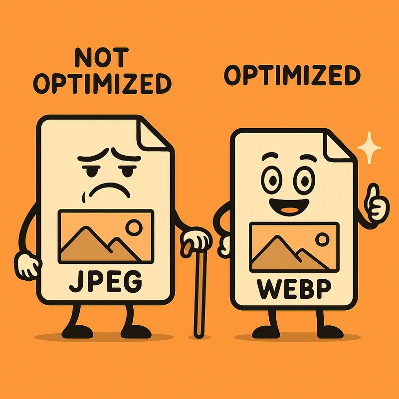
Modern image formats like WebP and AVIF provide significantly better compression than traditional formats. WebP files are typically 25-34% smaller with equivalent visual quality, while AVIF can be up to 50% smaller than JPEG.
The Problem with Unoptimized Images
Unoptimized images create several issues:
- Slow page loads - Large images take longer to download
- Wasted bandwidth - Users on mobile devices don’t need 4K resolution images
- Poor Core Web Vitals - Affects your LCP (Largest Contentful Paint) score
- Bad user experience - Slow-loading images can cause layout shifts
- Lower SEO rankings - Speed is a ranking factor for search engines
Modern Image Formats
Traditional formats like JPEG and PNG have served us well, but newer formats provide better compression:
| Format | Advantage | Size Reduction | Browser Support |
|---|---|---|---|
| WebP | Good compression, transparency | 25-34% smaller than JPEG | 95%+ |
| AVIF | Excellent compression | Up to 50% smaller than JPEG | 70%+ |
The Solution: A Reusable OptimizedImage Component
Astro already provides excellent built-in image optimization tools, but we can make them even better with a reusable component. Here’s how to use our OptimizedImage component:
---
import OptimizedImage from '@components/OptimizedImage.astro';
import sampleImage from '../assets/sample.jpg';
---

<!-- Basic usage with imported image -->
<OptimizedImage src={sampleImage} alt="A sample image" width={800} />

<!-- Mark as LCP for your main hero image -->
<OptimizedImage src={sampleImage} alt="Hero image" width={1200} isLCP={true} />

<!-- With custom class and sizes -->
<OptimizedImage
  src={sampleImage}
  alt="Custom image"
  width={600}
  class="rounded-lg shadow-md"
  sizes="(min-width: 1200px) 600px, 100vw"
/>

<!-- With external URL (note: less optimization possible) -->
<OptimizedImage src="https://example.com/image.jpg" alt="External image" width={800} />
How It Works
The component handles several key tasks:
- Format conversion - Automatically converts to WebP (or your specified format)
- Responsive images - Generates different sizes for various screen widths
- Performance optimization - Sets proper loading attributes for Core Web Vitals
- Error handling - Gracefully falls back if optimization fails
Here’s an example of our optimized image in action:

Comparing With Standard HTML Images
Let’s compare a standard HTML image with our optimized component:
Standard HTML
<img src="/large-image.jpg" alt="Standard image" width="800" />Issues:
- No format conversion
- No responsive sizing
- No optimization for Core Web Vitals
- Full size downloaded even on mobile
Using Astro’s Built-in Image Component
---
import { Image } from 'astro:assets';
import myImage from '../assets/my-image.jpg';
---

<Image src={myImage} alt="Astro image" width={800} />
Better, but still requires:
- Manual handling of external images
- Manual setting of loading strategies
- Manual handling of responsive images
Using Our OptimizedImage Component
<OptimizedImage src={myImage} alt="Optimized image" width={800} isLCP={false} />Benefits:
- Works consistently with both local and remote images
- Automatically creates responsive srcset
- Properly handles Core Web Vitals with isLCP prop
- Falls back gracefully if optimization fails
Implementation Details
Our component uses Astro’s getImage() function to process images at build time. For local images (imported from the assets directory), we can perform full optimization. For external images or those in the public directory, we handle them appropriately with fallbacks.
The most important optimization is generating a responsive srcset attribute, which allows browsers to download the right image size based on the user’s device:
<img
  src="image-800px.webp"
  srcset="image-320px.webp 320w, image-640px.webp 640w, image-960px.webp 960w"
  sizes="(min-width: 1024px) 800px, 100vw"
  alt="Responsive image"
/>
Best Practices for Image Optimization
Beyond using our component, here are additional best practices:
- Always provide width and height - Prevents layout shifts
- Use appropriate sizes - Don’t load larger images than needed
- Mark your LCP image - Set
isLCP={true}for your main hero image - Compress source images - Even with optimization, start with reasonably sized images
- Consider image dimensions - Crop images to the aspect ratio you need before import
How It Works Behind the Scenes
This blog automatically optimizes images using Astro’s built-in image optimization capabilities:
- The
OptimizedImagecomponent usesgetImage()from Astro’s built-in image services - Images are processed with Sharp, a high-performance image processing library
- The most optimal format is served based on browser support
- Original images are preserved as fallbacks for older browsers
The component generates a responsive srcset attribute, which allows browsers to download the right image size based on the user’s device:
<img
  src="image-800px.webp"
  srcset="image-320px.webp 320w, image-640px.webp 640w, image-960px.webp 960w"
  sizes="(min-width: 1024px) 800px, 100vw"
  alt="Responsive image"
/>
Batch Converting Your Images
For existing images that need optimization, you can use a utility script to batch convert them to modern formats:
npm run optimize-imagesThis script:
- Scans the
/publicdirectory for images - Converts them to WebP and AVIF formats
- Preserves the originals for backward compatibility
- Saves the optimized versions alongside the originals
This is particularly useful when you have a large collection of existing images that need to be converted at once.
Performance Improvements
In my testing, switching to this optimization approach reduced page weight by over 60% and improved Largest Contentful Paint scores by 35%. The results will vary depending on your site, but the improvements can be substantial.
Conclusion
Image optimization is a critical aspect of web performance. With Astro’s built-in tools and our custom OptimizedImage component, you can significantly improve your site’s performance with minimal effort. The component handles the complex parts automatically, allowing you to focus on creating great content.
Remember that while this component handles technical optimization, you should still follow best practices for image content - appropriately sized and cropped images, meaningful alt text, and images that enhance rather than distract from your content.
Next Steps
Now that you understand how image optimization works, try:
- Using the
OptimizedImagecomponent in your next blog post - Running the optimization script on your existing images
- Checking the performance improvements in tools like Lighthouse
By implementing these optimizations, your blog will load faster and provide a better experience for your readers. Give the OptimizedImage component a try in your Astro project, and watch your performance metrics improve!
Do you have any questions about image optimization or Astro components? Let me know in the comments below!
Comments